

To elevate CyberCopy's presence across print and digital media, I developed a refined visual identity grounded in clarity and trust. Preserving the company's established logo and signature blue palette, the new system introduced restrained typography, generous white space, and subtle geometric details to bring effortless consistency to every application.
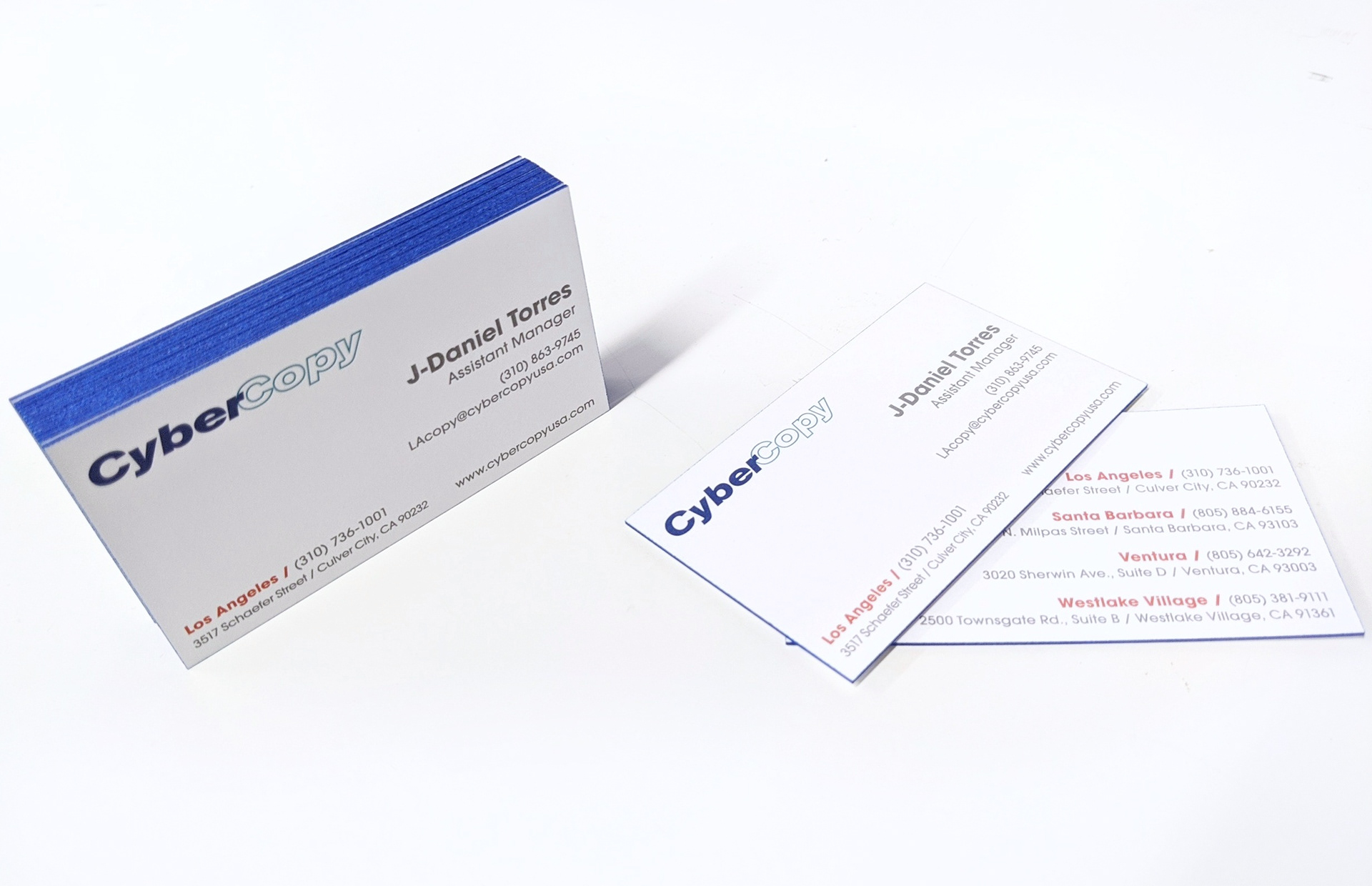
Company Business Card
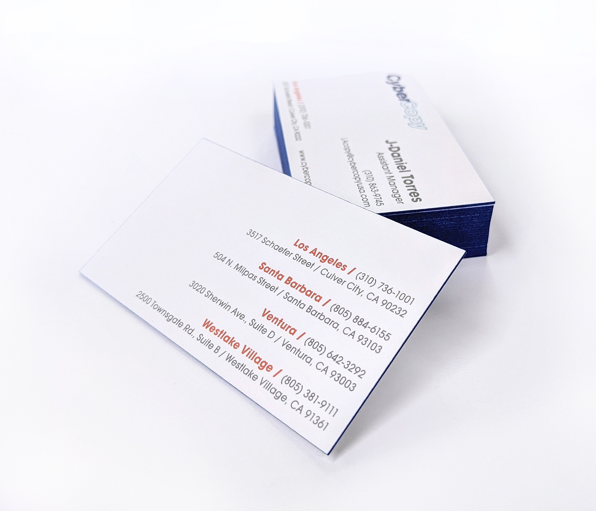
Company Business Card

Company Notebook
Business cards were produced on heavy 48pt matte uncoated cardstock with painted blue edges, using deliberate spacing and a functional layout that accommodated handwritten notes without compromising readability.
Branded notebooks featured delicate diagonal patterns against a bright white background, contrasted by vibrant blue-to-cyan gradients that introduced a more expressive visual element.

Binder Exterior Design
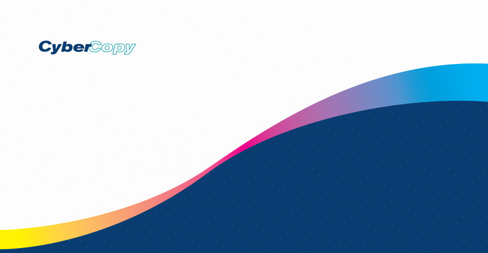
Binder Interior Design

Sales Binder

Sales Binder w/ Tabs

Sales Binder

Sales Binder Open
Further expanding the visual system into presentation materials, the sales binders featured vibrant blue surfaces, layered cyan patterns, and organic wave motifs inspired by the CMYK process. The resulting design struck a balance between a refined corporate aesthetic and a playful nod to CyberCopy’s roots in commercial printing.

Art Scanning Services Brochure

Art Scanning Services Brochure
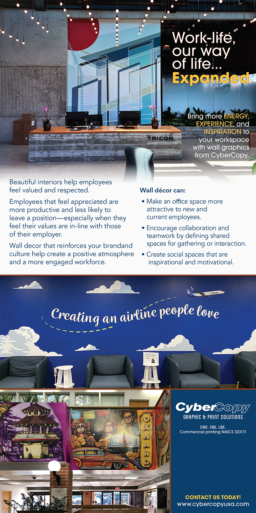
Email Blast
The tri-fold brochure and promotional e-blast designs carried the same design principles into informational and marketing materials, using structured layouts and selective blue accents to establish hierarchy and communicate services clearly.
Together, these applications established a recognizable and consistent presentation across customer interactions, reinforcing CyberCopy's commitment to quality, craftsmanship, and professional service.


